The first version of Before the Cabin had a beautiful view of the North Cascades and a problem: I was spending more time figuring out the interface than imagining a cabin in the woods.
Clicking through the prototype with Codex turned into a useful design session. Each time something felt awkward, we changed it. Eventually, the question became bigger than the placement of a button: how much planning should someone have to do before they get to enjoy the land?
My answer is now fairly clear. Give them a short introduction, let them choose a place, and get them out into it.
The first interactive woods
There is now a small 3D woodland running in the browser. It has sloping ground, trees, rocks, a creek, and three places to explore: Ridge Shoulder, Alder Bench, and Creek Hollow. The player can rotate the view, move across the terrain, zoom in, and switch between an overlook and a closer look.
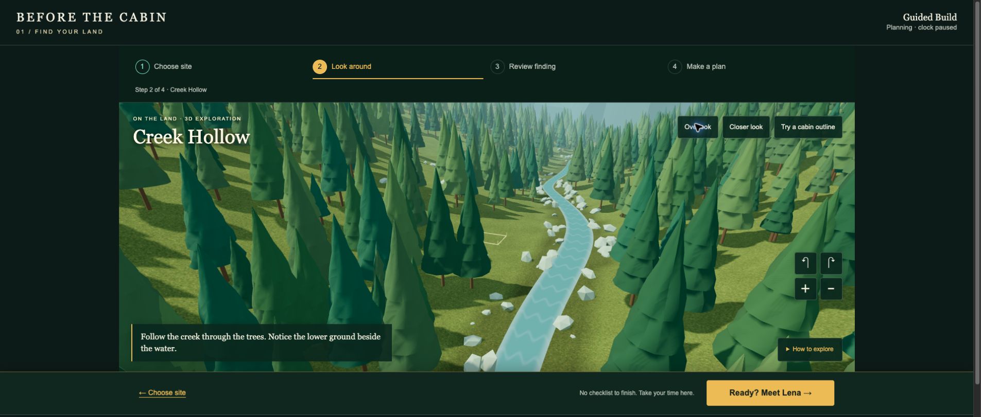
This is the guided mode. There is no observation quota to fill and no quiz standing between the player and the scenery. When they feel ready, one button takes them to Lena, the fictional surveyor, and her first document finding.
Moving that review later matters. I want the player to have some attachment to a place before asking them to think through the practical difficulties of building there.
What we took out
The earlier opening asked a quiz-style question about whether seeing a road was enough to establish access. It arrived before the game had taught the player anything, and then there were no comparable questions to establish a pattern. We removed it.
Another version asked the player to choose a limited number of investigation questions. That made even less sense to me. A careful builder would want answers to all the essential questions. The interesting choice is what to do with the findings, not which important question to ignore.
We also tried a comparison table that mostly repeated the same unknowns under three sites. It looked organized, but it did not help me decide anything. And an “Explore Map” feature enlarged the same picture I was already looking at. More controls did not produce more useful exploration.
Those experiments helped clarify what the opening needed: a place to explore, an obvious sequence, and decisions that change something the player can see.
Put an idea on the ground
The new scene includes a simple cabin-outline tool. Click open ground and an outline appears. Move around it, get closer, or try another location. It is a small interaction, but it connects the cabin idea to the shape and space of the land.
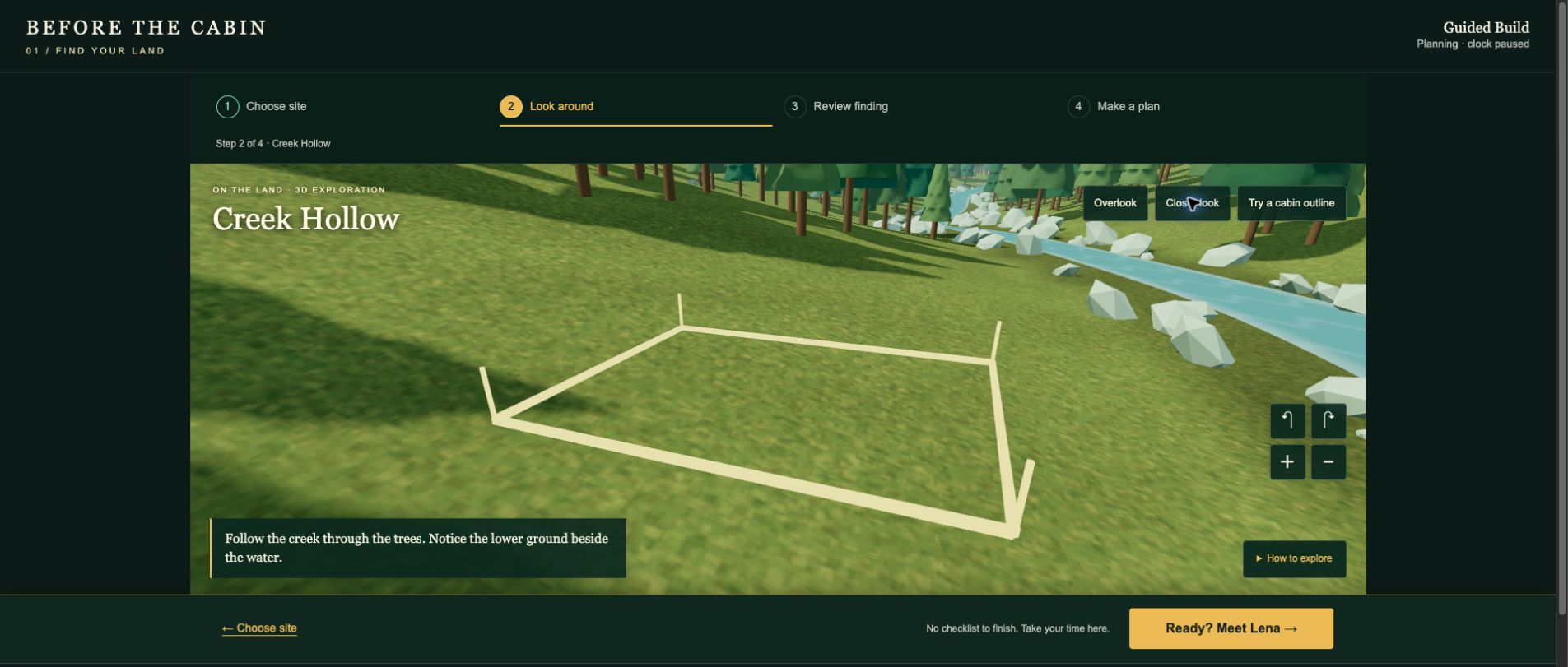
The tool does not level the ground, remove trees, or determine whether a foundation belongs there. It is there to let the player experiment. The exact outline position also does not yet carry into Lena’s document sketch; connecting those pieces is part of the next design work.
One clear next step
The opening now has four visible stages: choose a site, look around, review a finding, and make a plan. There is no site selected on the player’s behalf. The introduction is short, and the 3D scene gets the full width of the screen rather than competing with a crowded side panel.
The saved plan changed, too. Originally, it felt like being rewarded with a long list of paperwork. Now it leads with the player’s chosen direction, a sketch showing the idea, and the next investigation. The detailed checklist is still available, but starts collapsed.
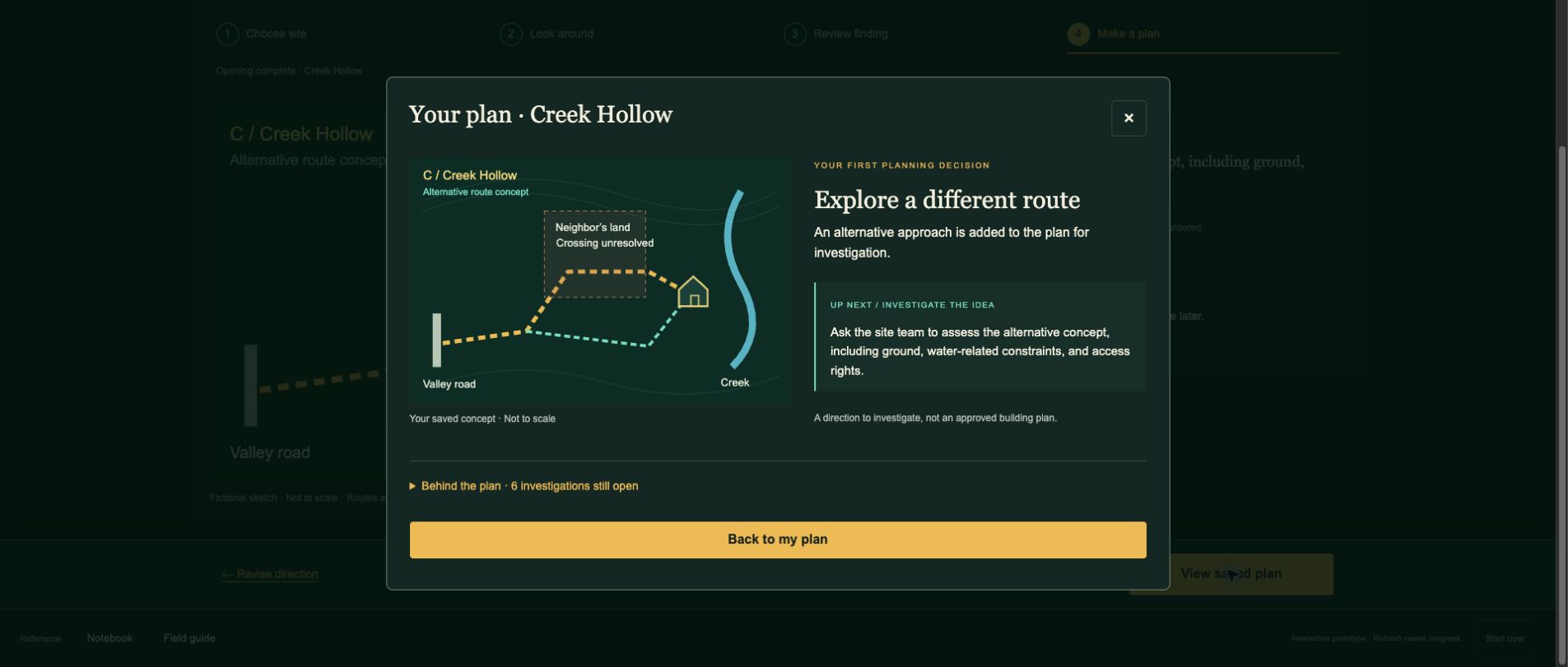
There is still plenty to investigate: access rights, deliveries and emergency access, ground and hazards, water and utilities, boundaries and permissions, and the full project budget. I want those subjects to arrive through situations the player understands. They should have a reason to care about the answer.
What this proves, and what comes next
We have moved from a visual concept to an interactive opening. Codex helped implement the woodland with Three.js, and we checked camera controls, outline placement, and the path through the first planning decision in Chrome. We also checked the layout at phone width.
That is still a long way from a finished game. The visual ambition remains much higher than these simple trees and terrain. A narrow browser window is not a substitute for testing on real iPhones and Android phones. The construction lessons still need source review, and this sample does not yet contain the purchasing, budgeting, or building systems.
The next challenge is to connect exploration to discoveries: something visible on this particular piece of land should lead naturally to an expert’s finding and a meaningful response. Then I want to watch someone unfamiliar with the project play it. My own feedback has exposed plenty of confusion already; a new player will find things I have stopped noticing.
For now, there is finally some land to explore before the paperwork begins.
← Previous: The game blueprint
Development entry by Nick Waine, prepared with Codex. Screenshots captured from the local browser prototype on September 28, 2026. Fictional terrain and preliminary scenarios; no technical assessment or final graphics quality is claimed.